
Figure or Table?
25th August 2017
I am in the process of putting a set of computational results into a paper. While working through the computational results section I realised that I will probably present all the results as figures. Now this is a little unusual for an optimisation paper, where tables definitely dominate the computational results landscape. However, I have come to like the use of figures. I want to discuss the use of each and try to sway you towards the use of figures in your next paper.
The table
This one is pretty easy to understand. Typically it has a header row with the different metrics that you want to show and the a column with the algorithm, instance, or whatever you are testing. It is very common to use tables to present results. There are many reasons for this.
The first reason is paper real estate. A table allows you to put a large amount of information is a very small space. That means that you can literately put every piece of information about your computational results in the paper. If you can't fit all information in the paper some people even go a little further and include an appendix with a detailed set of computational results. One example where there is a heavy reliance on computational results is my paper on the Steiner tree solver SCIP-Jack (Gamrath et al. (2017)). This paper includes at least one table per section and provides 14 pages of detailed computational results as tables. (I know that this is a self reference, but I felt if I am going to criticise work it should be my own.)
In the SCIP-Jack paper, the computational results are concisely presented in tables throughout. The tables provide information about the number of processed branch-and-bound nodes, the run time and the final optimality gaps. Also, in one table the details of the graphs are provided. Now, all of this information could be useful for some readers, but I doubt all readers need it. That is where the use of tables can fail. Sometimes it feels like little thought has been put into what data is absolutely necessary. It can be like a data dump. The author does not need to think about what to provide because they have the opportunity to provide everything that they have.
That brings me to the second reason. I feel that tables are one of the easiest ways to present the information. Typically the optimisation software outputs the results in a text based format. It does not take too much effort to convert this output into a table to be included in a paper.
Now these two reasons for using tables could be seen as both advantages or disadvantages. So I will leave the judgement up to the reader.
The figure
This one is also pretty easy to understand. The is some sort of picture that tries to describe some property of a problem or present some results. In regards to results, there are many different types of figures that can be used in a paper. In my case, I have used a variety, but mainly column plots and profile plots. A very common plot used in optimisation papers is the performance profile (Dolan and Moré (2002)). An example from a paper that I am currently working on is included below.
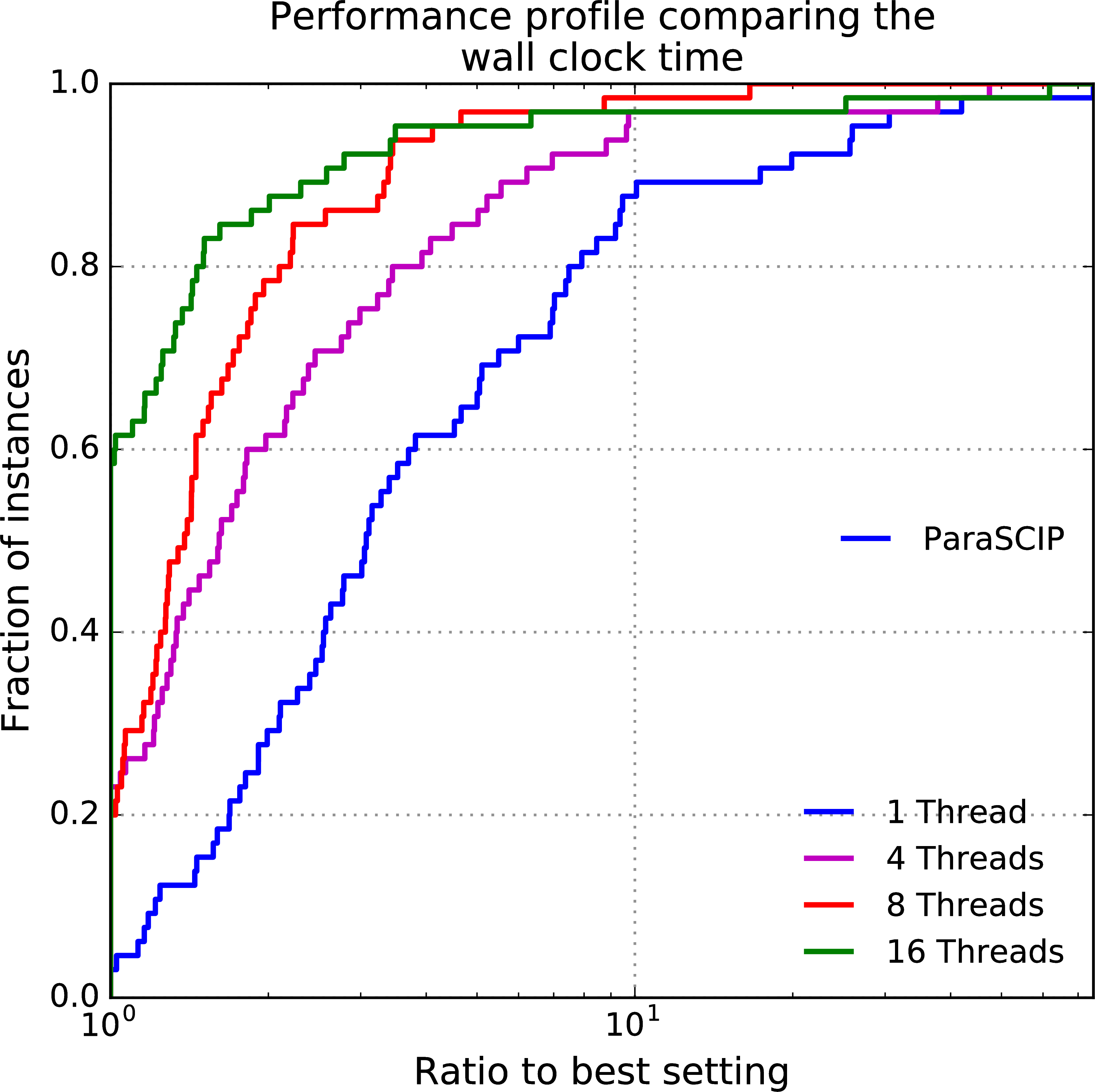
What are the problems with figures? The first is that they take up a lot of space. For a figure to be readable, it is good to limit the number of metrics that are presented for a given set of experiments. In comparison, a table of similar size will present multiple metrics while a figure presents only one (maybe two if appropriate). The second is that there is considerable more work to produce a figure compared to a table. It is possible to use packages to produce figures or alternative figures can be generated using matplotlib in python or pgfplots in LaTeX. But to use these methods requires more programming, which may not be what you want to do after getting your optimisation code stable.
One could say that substantially more effort is required to produce figures while there is not necessarily much to gain.
I don't fully agree with that statement. I definitely agree that it is more work to produce a figure, but I think that there is something to gain for this extra effort. A big advantage from using figures is that they make a paper more interesting for the reader. Also, the use of a figure indicates that the author thought about what is the most important piece of information to really show the value of the work. As a result from this effort, the narrative can become much clearer and the paper can tell a very interesting story.
One thing that I have to share about my experience using figures is that at times reviewers have asked for a table instead. I think that this occurs because there is such a dominance of tables in optimisation papers, that some reviewers get put off by the use of figures. It is not really a big issue and it just makes for an interesting reviewer comment.
My preference
If you have ready through any of my papers you will have noticed a predominant preference for figures. This is driven by two main reasons. The first is that my wife happens to be very good at creating interesting figures. So I always have an expert at hand to ask about the suitability of any figure that I create. Now, Penny works in climate science, which is a field that has many cool and interesting ways to present data, so my figures are always substandard compared to what my wife produces. The second reason for preferring figures is that they are more focused on the story that you are trying to tell. While it is not possible to give the same amount of information in a figure compared to a table, the figure makes the presented information more digestible.
While I prefer using figures in papers, there are many situations where a table is more appropriate. In a previous blog I wrote about the design of computational experiments (here). This blog referenced a number of papers, most of which use tables for the presentation of results. What is nice about those papers is that the tables do not include all data that was collected from the experiments, but only what is deemed necessary to demonstrate their point. These papers demonstrate a good use of tables.
Make your choice
So really the choice is yours how you present the computational results. I feel that there is a lack of figures in optimisation related journal papers. It would good to see a few more being included in the computational results section. Maybe we can develop some very interesting ways of presenting the results of our work. I would definitely be happy if I could include a figure in my papers that would impress climate scientists. But that is probably too much to ask!